Fake news on Twitter during the 2016 U.S. presidential election
- Authors: Nir Grinberg, Kenneth Joseph, Lisa Friedland, Briony Swire-Thompson, David Lazer
- Publication, Year: Science, 2019
- Link to Paper
Fake news on Twitter during the 2016 U.S. presidential electionMajor ResultsIntroData and DefinitionsFake news sourcesThree Classes of Fake News SourcesFake News Site-Type CountVoters on TwitterIdeologyResultsPrevalence and Concentration"Supersharers" and "Superconsumers"Who was Exposed to Fake News Sources?Fake News in One's News Feed, by IdeologyFake News Exposure, Likelihood of Sharing, and PredictorsOther factors associated with small increases in exposures to fake news sourcesWho shared fake news sources?Fake News and the Media EcosystemDiscussionLimitationsPoints of Leverage to Reduce Misinformation
Major Results
Only 1% of individuals accounted for 80% of fake news source exposures, and 0.1% accounted for nearly 80% of fake news sources shared
Individuals most likely to engage with fake news sources were:
- Older
- Conservative leaning
- Highly engaged wit political news
A cluster of fake news sources shared overlapping audiences on the extreme right, but for people across the political spectrum, most political news exposure still came from mainstream media outlets
Intro
Primary Research Questions
- How many stories from fake news sources did individuals see and share on social media?
- What were the characteristics of those who engaged with these sources?
- How did these individuals interact with the broader political news ecosystem?
Initial reports were alarming, reporting that fake news stories in the last 3 months of the election generated more shares, reactions, and comments than top real news stories [source]
- However, the scope of this problem overall is largely unknown
Studies of fake news also have described it's spread [source1] [source2], as well as highlighted the disproportionate role that automated accounts play in spreading this content [source]
- However, they do not examine the experience of the ordinary citizen
Survey research [source] and web browsing data [source] suggest that...
- The average American saw one or perhaps several fake news stories fake news stories about the 2016 election
- 27% of people visited a fake news source in the final weeks before the election and that visits to these sources constituted only 2.6% of hard news site visits
- 60% of fake news source visits coming from the most conservative 10% of Americans
However, because social media platforms have been implicated as a key vector for the transmission of fake news, it is critical to study what people saw and shared directly on social media.
Additionally previous studies of the online media ecosystem report:
"We wish to understand how fake news sources were positioned within this ecosystem. In particular, if people who saw content from fake news sources were isolated from mainstream content, they may have been at greater risk of adopting misinformed beliefs."
Data and Definitions
Fake news sources
Following in Lazer et al (2018), footsteps, fake news is defined as outlets as that may look like legitimate news sites but that "lack the news media’s editorial norms and processes for ensuring the accuracy and credibility of information."
- The attribution of “fakeness” is at the level the publisher (as opposed to the story)
Three Classes of Fake News Sources
Categories differ based on the likelihood that they will produce fake news but also based on how the list was created...
- Black —> websites taken from preexisting lists of fake news sources constructed by fact checkers, journalists, and academics who identified sites that published almost exclusively fabricated stories [source1] [source2] (taken from the survey and web browsing data links above)
Additional sites were taken from Snopes.com (identified as sources of "questionable claims") and manually annotated by the authors of this paper as red or orange
- Red —> Sites (e.g., Infowars.com) that spread falsehoods which clearly reflected a flawed editorial process
- Orange —> Sites where annotators were less certain that the falsehoods stemmed from a systematically flawed process
Fake News Site-Type Count
| Black | Red | Orange |
|---|---|---|
| 171 sites | 64 sites | 65 sites |
Voters on Twitter
Linked a sample of U.S. registration records to Twitter accounts to create a panel
- Tweets were collected for 16,422 active accounts during 2016 election
- Obtained lists of the followers and followees
Compared to a representative sample of U.S. voters on Twitter obtained by the Pew Research Center, the users in their panel are representative in terms of age, gender, race, and political affiliation
Estimated news feed of panel by taking a "random sample of the tweets posted by their followees"
- They used the Decahose! (10% sample of Twitter's tweets)
The collected followee tweets represent the tweets which a panel member could have seen in their news feed and, thus, are referred to as "exposures"
Restricted analysis to only political tweets that contained a URL to a web page outside of Twitter
- They created a classifier to identify political tweets (based on keywords) and evaluated it by comparing it's performance to human annotators
Ideology
Users are split into five political categories by comparing an individuals Twitter feed to feeds from registered Democrats and Republicans.
Political Categories
- Extreme Left (L)
- Left (L)
- Center (C)
- Right (R)
- Extreme Right (R)
How they do this, from the supplementary materials
We devise a continuous political affinity score for panel members and evaluate its accuracy in three different ways. The score estimates the similarity of an individual’s exposures to those of registered Democrats and Republicans using a logistic regression model, given individuals’ news diet on Twitter and precinct-level vote share in the 2012 general election. With respect to vote share, we use as a feature, for each individual panel member, the percentage of the vote received by Obama in the precinct in which their voter registration address is located. As a measure of people’s news diet, we average the political alignment of news sources the individual is exposed to on Twitter as describe below.
We infer the political alignment of news sources using a method similar to the one used by Bakshy et al., with a key distinction — we use exposure information rather that sharing of the source by partisans. This distinction lets us base our score on a much larger set of people who consume politics, but rarely tweet about it. As such, we compute a news source’s alignment as the proportion of registered Republicans and Democrats who were exposed to the source, and re-weight to correct for the imbalance of the two parties in our sample. In order to reduce the impact of cases where exposure to a news source is unlikely to reflect one’s political affinity, we only consider individuals with a minimum of 100 observed exposures to politics, and sites that occupying 1% or more of all political URLs in a person’s timeline. In addition, we only compute alignment scores for news sources with at least 30 registered voters. Fake news sources were excluded from the scores computation since a major part of our analysis pertains to the consumption of fake news as a dependent variable.
Results
Prevalence and Concentration
5% of aggregate exposures from fake news sources
- We can also see that these exposures grow as we approach the election (Fig1A)
6.7% of shared political urls were fake news sources
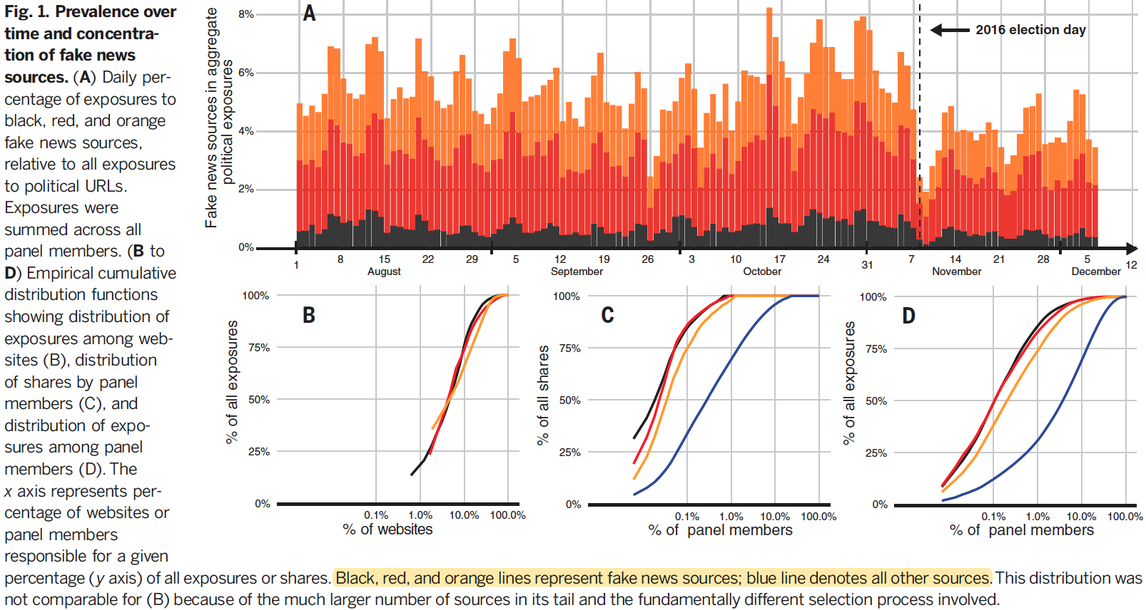
Within each category of fake news, 5% of sources accounts for more than 50% of exposures (Fig 1B)
- Most exposures to red and orange sources (2.4% red, 1.9% orange, and 0.7% black)
- Most exposures driven by only a handful of popular red and orange sources
- Top seven fake news sources (all red or orange) accounted for more than 50% of fake news exposures
"Supersharers" and "Superconsumers"
Content was also concentrated among a small number of panel users
- 0.1% of the panel accounted for 79.8% of shares from fake news sources
- 1% of panel consumed 80% of the volume of from fake news sources
Median Daily Number of Tweets
| Supersharers | Avg. Users |
|---|---|
| 71x | 0.1x |
Median Daily Number of Exposures to Political URLs
| Superconsumers | Avg. Users |
|---|---|
| ~4,500 | 49 |
Median Daily Supersharer Political URL Sharing Habits
| Political URLs Shared per Day | Fake News URLs Shared per Day |
|---|---|
| 7.6 | 1.7 (of the 7.6) |
Superspreaders and superconsumers of fake news sources even stand out among the overall most politically active accounts within he panel — i.e. the top 1% of sharers and consumers (Fig 2)
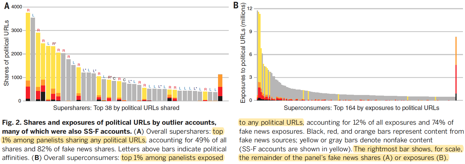
Given the high volume of posts shared or consumed by superspreaders of fake news, aswell as indicators that some tweets were authored by apps, we find it likely thatmany of these accounts were cyborgs: partially automated accounts controlled by humans. Their tweets included some self-authored content, such as personal commentary or photos, but also a large volume of political retweets. For subsequent analyses, we set aside the supersharer and superconsumer outlier accounts and focused on the remaining 99% of the panel.
Who was Exposed to Fake News Sources?
Fake News in One's News Feed, by Ideology
Excluding outliers, panel members averaged 204 potential exposures [95% confidence interval (CI): 185 to 224] to fake news sources during the last month of the campaign
5% of this translates to 10 exposures (on average) (95% CI: 9 to 11)
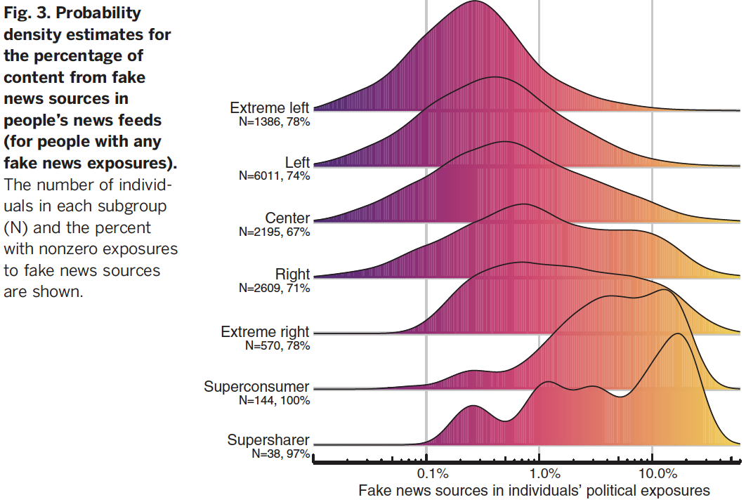
The average proportion of fake news URLs in a newsfeed (of all political URLs) was 1.18 (95% CI: 1.12 to 1.24%) however there was a large and significant gap based on political affinity (p < .0001)
- Of people who had 5% or more of their political exposures from fake news sources constituted 2.5% of individuals on the left (L and L) and 16.3% of the right (R and R) [see Fig3]
Fake News Exposure, Likelihood of Sharing, and Predictors
According to binomial regressions fit separately to each political affinity group, the strongest predictors of the proportion of fake news sources in an individual’s feed were the individual’s age and number of political URLs in the individual’s feed (Fig. 4, A & B)
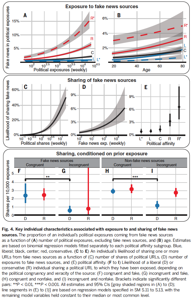
A 10-fold increase in overall political exposures was associated with doubling the proportion of exposures to fake news sources (Fig. 4A)—that is, a 20-fold increase in the absolute number of exposures to fake news sources. This superlinear relationship holds for all five political affinity groups and suggests that a stronger selective exposure process exists for individuals with greater interest in politics.
- Fig 4A: As you average weekly political exposures go up, so does your fake news exposures, most true for conservatives
- Fig 4B: As your age go up, so does your fake news exposures, most true for those on the right
Other factors associated with small increases in exposures to fake news sources
- Men
- White people
- Voters in swing states
- Voters who sent more tweets (excluding political URLs analyzed here)
These findings are in line with previous work that showed concentration of polarizing content in swing states [source] and among older white men [source]. However, effects for the above groups were small (less than one percentage point increase in proportion of exposures) and somewhat inconsistent across political groups.
Who shared fake news sources?
Fewer than 5% of people on the left or in the center ever shared any fake news content
11 and 21% of people on the right and extreme right did, respectively (P < 0.0001)
Likelihood of sharing fake news goes up when [figure]:
- Fig 4C: as political shares goes up
- Fig 4D: as fake news exposures goes up
- Fig 4E: as political affinity moves right
Sharing Conditions on Prior Exposure [figure] (Fig 4 F-I)
Liberals and conservatives shared politically congruent sources similarly for fake news and non-fake sources
Incongruent sources were shared at significantly lower rates than congruent sources (P < 0.01), with two exceptions
- Conservatives shared congruent and incongruent non-fake sources at similar rates
- They lacked the statistical power to assess sharing rates of conservatives exposed to liberal fake news, owing to the rarity of these events
These findings highlight congruency as the dominant factor in sharing decisions for political news. This is consistent with an extensive body of work showing that individuals evaluate belief-incongruent information more critically than belief-congruent information [source]. Our results suggest that fake news may not be more viral than real news [source].
Fake News and the Media Ecosystem
In a manner similar to other analyses of media co-consumption [source], we constructed this co-exposure network by using a technique that identifies statistically significant connections between sites [source]. (Fig 5)
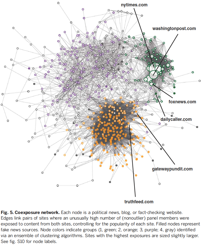
Four groups of websites were cluster together, 3 of which consistently clustered together (using three different clustering algorithms). Group 4 consisted of the remaining nodes.
Group 1: A collection of nationally relevant mainstream media outlets
Consisted of only 18.4% of sites
Responsible for vast majority of political URL exposures ranging from, on average,
- Extreme right —> 72% of exposures
- Extreme left —> 86% of exposures
These sites were mostly centric in their political leaning
Group 2: significantly more conservative
68% were fake news sites
- This is substantially more than Group 1 (3.6%), Group 3 (2.0%), or Group 4 (11.4%)
Exposure to Group 2 varied considerably by political affinity
Exposures to Group 2 sites make up the following proportion of exposures outside of Group 1 sites
- Extreme right —> 64.2% of exposures
- Right —> 38.6% of exposures
- Center —> 22.2% of exposures
- Left —> 13.9% of exposures
- Extreme Left —> 8.0% of exposures
The high density of Group 2 suggests that users likely saw multiple URLs from this group
Out of 7,484 non-outlier panel members that saw at least two fake news URLs
- 95.6% of them saw URLs from at least two different fake news sources
- 56.4% encountered URLs from at least five
Group 3: significantly more liberal
In summary, fake news sources seem to have been a niche interest: Group 2 accounted for only a fraction of the content seen by even the most avid consumers of fake news but nonetheless formed a distinct cluster of sites, many of them fake, consumed by a heavily overlapping audience of individuals mostly on the right.
Discussion
6% of shared political URLs were contain fake news URLs
- However, the vast majority of the fake news shares and exposures can be attributed to a tiny portion of the population
The average panel member saw only 10 fake news URLs (1.18% of political exposures) during the last month of the election campaign period
- The vast majority of all political exposures still came from non-fake news sources
It's important to understand the mechanisms behind human behavior and sharing patterns
- For example, older individuals may be more inclined to share fake news because of cognitive decline, lack of digital media literacy, stronger motivated reasoning or cohort effects
Still appears that this data was inclusive of cyborgs — this should likely become an important focus of research as automated accounts become more sophisticated
Limitations
- Data comes from a sample of Twitter, findings may not generalize to other platforms
- Sample is representative of registered voters on Twitter, however, the sample may differ from the Twitter population in other ways
Points of Leverage to Reduce Misinformation
Discourage users from following or sharing content from the established fake news sources
Disincentivize frequent posting — Platforms could:
Algorithmically demote content from frequent posters
Prioritize users who have not posted yet that day
…a simulation of capping political URLs at 20 per day resulted in a reduction of 32% of content from fake news sources while affecting only 1% of content posted by non-supersharers
Platforms could work more closely with fact checking organizations to watch top producers of fake news content, and then utilize the dense co-exposure network to identify new low quality sources
Such interventions do raise the question of what roles platforms should play in constraining the information people consume. Nonetheless, the proposed interventions could contribute to delivering corrective information to affected populations, increase the effectiveness of corrections, foster equal balance of voice and attention on social media, and more broadly enhance the resiliency of information systems to misinformation campaigns during key moments of the democratic process.
Notes by Matthew R. DeVerna